What was your main inspiration to create the STERE line?
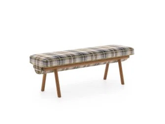
I like to think of myself as a storyteller . Whatever the field I explore, from writing to design and prints, I treat them equally because they are complementary, even inseparable. Each of my project begins with a story. For the bench STERE, I enjoyed recalling the emotions of an arrival in a vacation home, that we know intimately or that we discover for the first time. These are simple sensations and pleasures: opening the shutters, letting the light in, putting the furniture in the bushy garden and improvising a meal after a long and tiring drive. Suddenly a thunderstorm starts to rumble, so the furniture is moved to a safe place. The idea for the STERE bench was born from these fleeting impressions, from these holiday memories, from a rhythm and a quest for comfort close to abandonment. I imagined that we could come and rest on the bench. It’s a type of furniture that I like for several reasons. Because it’s low, it doesn’t block the view and doesn’t impose itself. It simply offers the pleasure of sitting on it, alone or with others.
What is your favorite material to work with?
I don't have a favourite material, because for me, a material, as attractive as it can be, must serve an idea or a form rather than the opposite. I’m interested in their qualities of course, but especially the know-how and the use that come with them. Therefore, I like to work with curved glass, turned oak or paper in an artisanal process, as much as aluminum and color in a very industrial environment, like in some companies in the Netherlands. But if I had to choose one, it would probably be wood. Its organic forms, its branches, its bark or its cut logs inspire me a lot. This is what we find in the STERE bench.
Can you describe your creative process?
I have a very tactile and sculptural approach. If I am very keen to write down a few notes, it’s to start things in volume very quickly. I use plaster, clay or any material I can get my hands on. The 3D modelling or the more advanced drawings will come later because what interests me is, first of all, the touch, to feel things. The creation of the STERE bench comes from this same process of modeling and mock-ups. I like the idea of imperfect models or drawings because they tell us a lot without fixing anything. A simple folding is sometimes enough to evoke an idea and there will always be time later to be a perfectionist! This allows me to be free to change the scale and to dialogue with the skills involved. If, by chance, a satisfying result is achieved quickly, there is then a long process of adjustments, the choice of materials, and exchanges with the craftsmen, that always greatly nourish any project.
How would you define your aesthetic?
I’m attached to the idea of a sculptural, narrative and organic aesthetic, an artistic world both playful and sophisticated. However, the objects, furniture and lighting that I create are not sculptures to be only touched with the eyes! They meant to be functional and dedicated to interiors where we like to meet up. True companions, I would say.
How did you work with Pierre Frey's workshop?
In a very intuitive way. La Maison Pierre Frey challenged me to combine wood and fabric to create their first outdoor furniture, and at the same time to bring in something very personal, my signature. Among the different ideas I explored, I was interested in bench, a piece of furniture that works equally indoors and outdoors and that can be grabbed and moved around as desired. It’s by definition a convivial object to be shared: we can sit on it alone or with others, isolate it in a corner of the garden or bring it closer to a large table. From there, I wanted to mix the carpentry know-how and the textile of Pierre Frey to give priority to the fabric, and not to blur the tracks by insisting too much on the presence of the wood or on its forms. I enjoyed "jamming" the textile into its wooden base and thus suggesting the making of this strange assembly. At first sight, it’s a simple bench, but when you go around it and look at it from the side, you see this overflow contained by the structure and the base. I think this is what makes it so original.


